Designing a Budget
March 21, 2019
Originally posted on
 Medium
Designing a Budget
This post describes the design of Budget Haver, a minimalistic budgeting app that’s focusing on controlling spending that you can totally sign up to the beta for, right here. To best understand why this app exists (because clearly, what the world really needs is yet another budgeting app), you should read “Having a Budget” first.
So at some point, I decided to make a budgeting app. I was designing it for myself, so it didn’t have to be pretty (those of you who are in web design will notice that I’ve bootstrapped and fontawesomed the hell out of this — I’ll be working on the look and feel in the coming weeks), but it did need to be well designed. Because this is, at a basic level, a habit-forming app, and habit-forming is something I’ve always struggled with.
In the end, I followed three basic principles in the design. In a surprise twist, I’m going to go through these principles now. In this blog post. Woah.
1. Balance is Overlord
Overlord: the best gender-neutral replacement for ‘King’? Also quite great: Potentate (mostly because it sounds like ‘potato’).
One of the underlying premises of this app is that most budgeting apps overcomplicate things: they start adding categories and sorting and all sorts of fluff, and in doing so basically imply that people can’t really make good decisions in the moment.
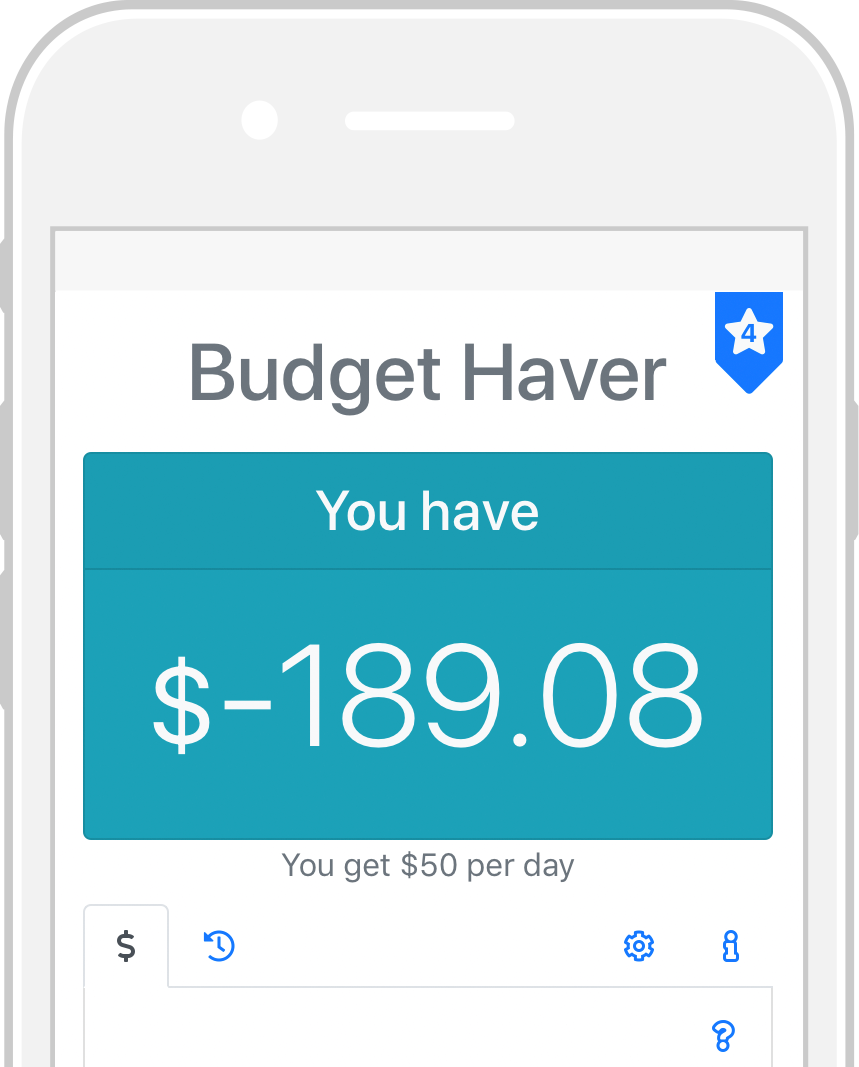
The Balance: big and in your face. Also, my tour of the salt flats of Bolivia was a bit more expensive than expected…
My counter to that is that people can make good, and quite complicated, decisions moment-to-moment, but the right information needs to be clear and present for them to do so. If I can boil down that information into a single number and help you internalise that number, you can probably make good decisions.
That number is the balance: it represents how much money you have, and it doesn’t care about how much money is in your bank account, in your wallet, or how you spend that money. It goes up by a certain amount each day, and goes down when you spend.
To help me internalise this number, I needed it to be big and present. So it takes up about half the screen, and is there regardless of what part of the app you’re in. You can’t escape it.
2. Make Spending Easy
And when I say ‘make spending easy’, I’m talking about logging spending. Capitalism has already made spending easy — that’s kind of the problem.
If this was going to work at all, I needed to build a habit of logging my spending. This actually has 3 purposes:
- Keeping the balance accurate
- If you go to log your spending before you make the spending decision, it creates a decision point (‘Can I afford this?’) that didn’t exist before. This can change your behaviour in the moment, and has done so for me on multiple occasions
- Every time you log your spending, you look at your balance, helping you to internalise it (this is why it’s important that logging is manual — even if I could make it automated, I wouldn’t)
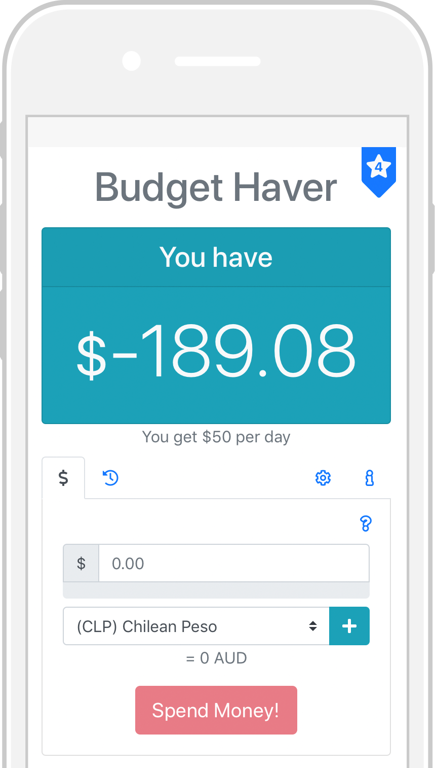
You can do everything you need to log spending without ever changing screens or scrolling (except on an iPhone SE. Those screens are tiny!).
So a lot comes down to whether you log your spending. Which means that logging needs to be incredibly easy.
This had a couple of impacts. First, it actually helped determine what technology I used — I was more familiar with Unity for app-building at the time, but Unity apps have long load times, and minimising this is vital. A couple of seconds here can make all the difference.
Secondly, it’s essential that you can log a spend without ever changing screens. I’ve not found any budgeting app that does this — you always have to go to a second screen to categorise, add notes or whatever else. I’ve jettisoned all of these features because it’s more important that I log every time I spend, than it is that I have context or metadata about my past spending. That doesn’t mean that the app will never have these features (I fully expect categorisation to be the #1 feature request, and I’ve got some ideas of how to achieve this without violating this principle), but they won’t be there at launch.
Currencies
A feature that is absolutely necessary for logging every spend, however, is currency conversion. When I was building the app for myself, I was manually building the currencies I was using into the app each time, changing that list in code whenever I changed countries. Obviously this won’t do for a wider release.
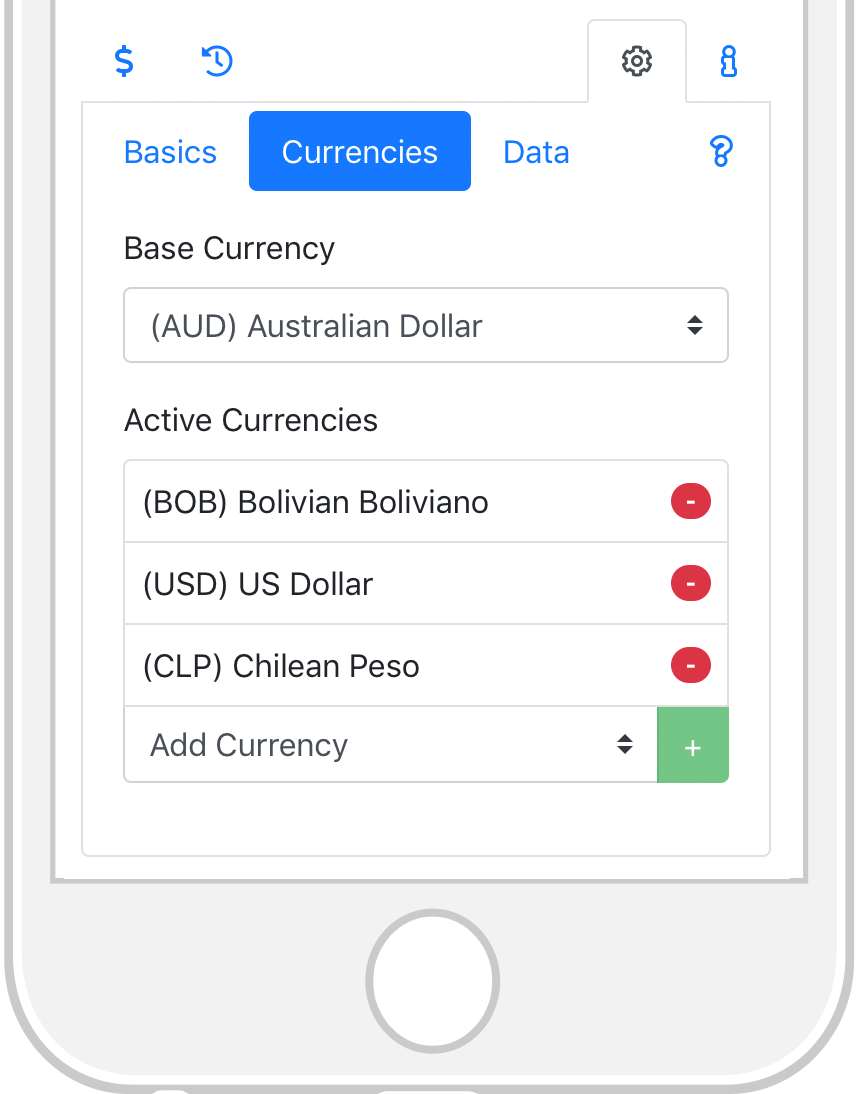
The screen for editing which currencies are ‘active’. Guess which part of the world I’m in?
For a proper release, you need every currency. But having a list of every single currency to scroll through is unwieldy and breaks this “Make spending easy” rule. So I added the concept of ‘Active currencies’, which lets a user choose a short list of currencies they’re using right now.
It’s telling that since starting to use it, Budget Haver has become my go-to currency-conversion app. It always knows the base currency I care about (AUD), as well as the currencies I’m actively dealing with at any one time. It’s also super quick.
And as a bonus, every time I use it for currency conversion, it also helps me internalise my balance.
3. Be Kind
I’ve tried a lot of apps that aim to change behaviour, and designed lots of schemes for myself to change habits. What I find happens a lot with these sorts of things is that they frame success and failure in black-and-white terms. You succeed if you do the thing every single time, and if you don’t, you fail.
This definitely works for some people, but I’m not one of them. I find that I change my behaviour for a couple of weeks, and then I slip for some reason or another. At that point, I’ve failed and I’m not super excited about starting back up again. So the habit slips, but more importantly, the mechanism I had for helping me build the habit slips as well.
I find ‘streak’ systems particularly bad for this sort of thing. They really annoy me.
So when I went to change my habits around spending, I knew I couldn’t frame success in black and white terms. This is tricky with this sort of budgeting system, because there’s an implicit fail state: having a negative balance.
I knew there was a good chance that I’d go into negative balance at some point — sometimes your expenses are just higher than others, and that’s got to be OK. And I didn’t want these changes to adjust how I treat money with those around me — I’m not someone who usually sweats a few dollars here and there, and I don’t want that to change, even if I have ‘negative money’ (note that the jury’s out on this: just having more awareness of money changes these sorts of relationships anyway, so the best you can really do is be aware and adjust as you go).
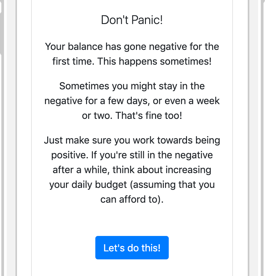
The message that appears the first time your balance goes negative… and I just realised that I used the wrong “You’re”. This is what beta testing is for — fix incoming in v0.6.1!
This doesn’t really show up in the interface, so much as it relates to what the interface doesn’t do. It doesn’t turn red when you go into the negative. It doesn’t treat you any differently. You can easily change your balance and daily budget whenever you want, without judgement.
Because it’s more important that you keep using the app, that you have more awareness of your financial situation, than it is that you get it right every time.
I’m still working out the best ways to integrate this idea into a proper app release, because it’s the part of the app which is most internal to my mental state when using it. So far that’s taken the form of messages within the app (specifically, the first time your balance goes negative), and I think that the look and feel layer will have a lot to do with it. But it’s a work in progress.
The End of Principles
That’s about it for now. There’s a lot of other small interface details I’ve not really discussed here (the design and purposeful limitations of the ‘history’ tab, the spend %age bar that shows how much of your budget the current spend), but they’re secondary results of these three principles.
Next time, I’ll be talking about everyone’s favourite topic: monetisation. A large part of why I’m taking the time to prepare this app for wide release (and compete in the absolutely insane productivity app space… why am I doing this again?) is to test out some thoughts I’ve been having about monetisation for a while (oh right, that’s why), so it’s probably time to talk about those thoughts.
In the meantime, sign up to the beta for Budget Haver here, and let me know what you think!